How to design a restaurant menu using AI: A step-by-step guide
- AI menus look like AI when the food isn't yours and the design isn't your brand. Start every photo from a picture of your own dish, and save your colors, fonts, and logo before you design anything.
- Decide which 2 or 3 dishes to feature before you pick a layout. An AI menu tool can't tell which dishes earn you the most until you give it your sales and costs, so on its own it spreads attention evenly and nothing stands out.
- Check the finished menu for AI tells: stray lettering in photos, a font that isn't yours, a dish that doesn't look like the plate, and any price that doesn't match your list.
How to make a restaurant menu
Thanks to AI, you can learn how to design a restaurant menu in an afternoon now. The problem is, however, that most AI menus look alike: the same cream background, the same font pair, and a glossy photo of a generic burger.
To make a menu that looks like it came from your kitchen, give AI 3 things it can't make up: photos of your own dishes, your brand (colors, fonts, and logo), and your restaurant decor. With those, AI tools do the slow parts for you: a chat tool sorts your dish list, and an AI menu generator restyles your phone photos and lays out the menu for print and Instagram.
Why many AI menus look like AI slop
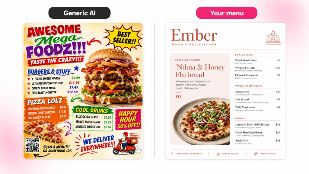
Generic AI images look alike and slightly off. On a menu, you can spot them in 5 ways:
- Food that isn't your food: Ask AI for "a margherita pizza" and you get the average of every margherita it's seen, not your charred crust or your basil
- Default colors and fonts: With no brand saved, many tools fall back on the same palette and the same serif-and-sans pair, so your menu looks like every café in your neighborhood
- Garbled lettering: Image models still mangle words. A dish name painted onto a chalkboard in the background, or a logo the AI redrew, is the fastest giveaway
- Photos that don't match each other: One dish on marble, one on wood, one shot from above. Side by side, they look like stock photos from 3 different sites
- No hierarchy: Without your sales and costs, AI can't tell which dishes make you money, so it gives them all the same weight, or puts a "most popular" badge on a random dish
Step 1: Pick the dishes your menu design will feature
The first step is deciding which 2 or 3 dishes the menu should highlight the most. These ones get the photo, the box (a border or shaded panel around the dish), and the top spot in their section. If you skip this step, you're just designing a pretty list.
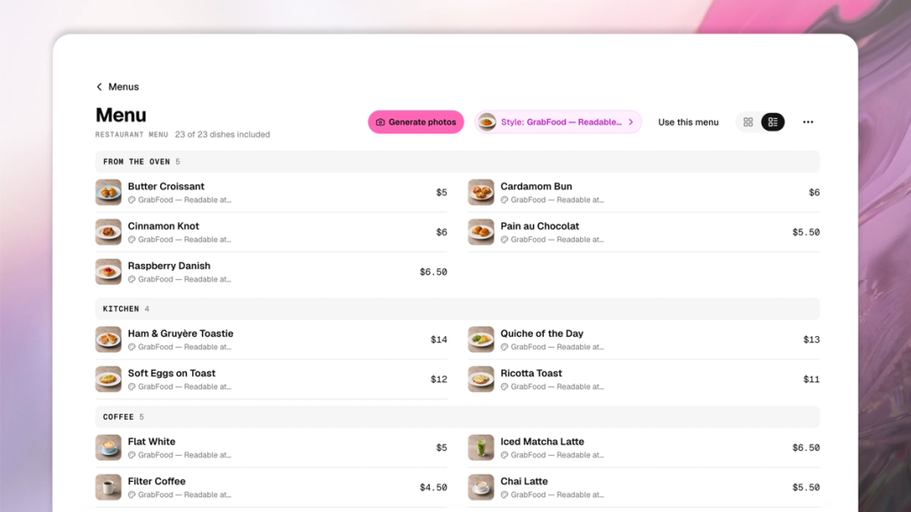
Build one dish list with AI
Gather what you already have: your current menu (a PDF, a photo of the printed one, or your delivery app page), last month's sales-by-item report from your POS (point of sale) system, your recipe cards, and your latest supplier invoices.
Then let AI sort them. Menu engineering, a method Michigan State University professors Michael Kasavana and Donald Smith developed in 1982, puts every dish in one of 4 groups by how well it sells and how much it earns. Loaded, a restaurant management software company, lays out how it works today.
Upload your files to any AI chat tool with this prompt:
"Build a table with one row per dish: dish name, section, price, ingredients, allergens, number sold last month, and ingredient cost per plate. Take names and prices from my menu, sales from the POS report, ingredients and allergens from the recipes, and costs from the invoices. If you can't find a value, write MISSING instead of guessing. Never work out an allergen from the ingredients, and don't change any price or dish name. Then work out each dish's margin (price minus ingredient cost) and sort every dish into Stars, Plowhorses, Puzzles, or Dogs, comparing it with the averages for its own section."
Here's what each group means for your design:
| Group | Sells | Earns | Where it goes on the menu |
|---|---|---|---|
| Stars | Above average | Above average | Featured: a photo or a box, near the top of its section |
| Puzzles | Below average | Above average | Featured, with a better description or a "Chef's pick" tag, so more people notice it |
| Plowhorses | Above average | Below average | Regular listing. Fix the price before the menu goes to print |
| Dogs | Below average | Below average | Take it off this menu, but keep it in your list in case you bring it back |
How to price a menu before you design it
Next, it's time to learn how to price a menu. Toast, a restaurant POS company, says a food cost of 30% to 35% of the price is a common rule of thumb. To price a dish, divide what the ingredients cost by the percentage you're aiming for.
Say your burger costs $4.20 in ingredients and you want food cost at 30%. $4.20 ÷ 0.30 = $14. Now take a pasta dish that costs $2.10 to make and also sells for $14. The burger nets you $9.80 and the pasta nets you $11.90. If they sell about the same, the pasta is the one to feature.
Ask the same AI chat to do the math for every dish. Then decide which new prices your customers will accept. Use this prompt:
"For every dish with a food cost above 35%, tell me the price that would bring it to 30%, rounded to the nearest 50 cents. Show old and new prices side by side."
Step 2: Save your brand before you design
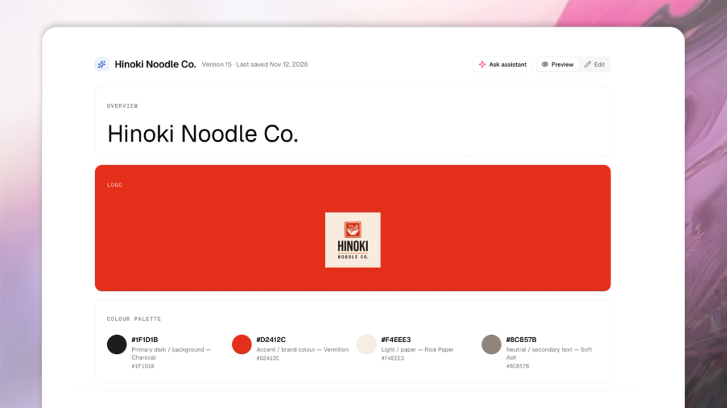
The biggest giveaway to an AI generated menu is bland fonts and colors. Be sure to use an AI tool that lets you save your brand once (your logo file, your font files, and your color codes), so every menu, poster, and post looks like it was designed specifically for your restaurant. SecretSauce for example, has an entire Brand Brain that does just that.
Take your colors from your decor
If you don't have brand colors written down, look around your restaurant. The green of your awning, the terracotta of your floor tiles, the brass on your bar, the color of your plates. Menus that use the colors customers see when they walk in feels more like it would belong on your tables.
Menus use color for 6 jobs. Pick one from your brand for each:
- Page background: Usually your lightest color, or your darkest if you want a moody, low-lit feel
- Main text: Dish names and prices
- Muted text: Descriptions, in a softer shade of the main text
- Accent: Section headings and featured boxes. Use one accent, not three
- Thin lines: Dividers under headings and between sections
- Panel tint: A soft fill behind your featured dishes
Then check that the text is easy to read. Dish names and prices need a contrast ratio of at least 7:1 against the page, and descriptions at least 4.5:1. To get the ratio, paste both color codes into a free contrast checker or ask an AI chat. If your brand color fails, use a darker or lighter shade of the same color rather than switching to a new one. Pale sage on cream looks lovely on a mood board but would disappear under a dim restaurant light.
Use your own fonts and logo
Upload the font files themselves (the .otf or .ttf files you got with the font), not only their names. With only a name, many tools swap in the closest free font.
If you don't have brand fonts, pick 2: a display font (a bold font made for big sizes) for your restaurant name and section headings, and a plain, readable font for dishes and descriptions.
If your sign uses hand lettering, chalk, or neon script, let the artwork carry that feel and keep the menu text in your fonts.
Always use your own logo file. Never let AI draw or redraw it, and never let it write words into an image. Every dish name, price, and heading on the menu should be typed text placed on top of the design, so it stays sharp and spelled right.
Step 3: Start every photo from your own dish
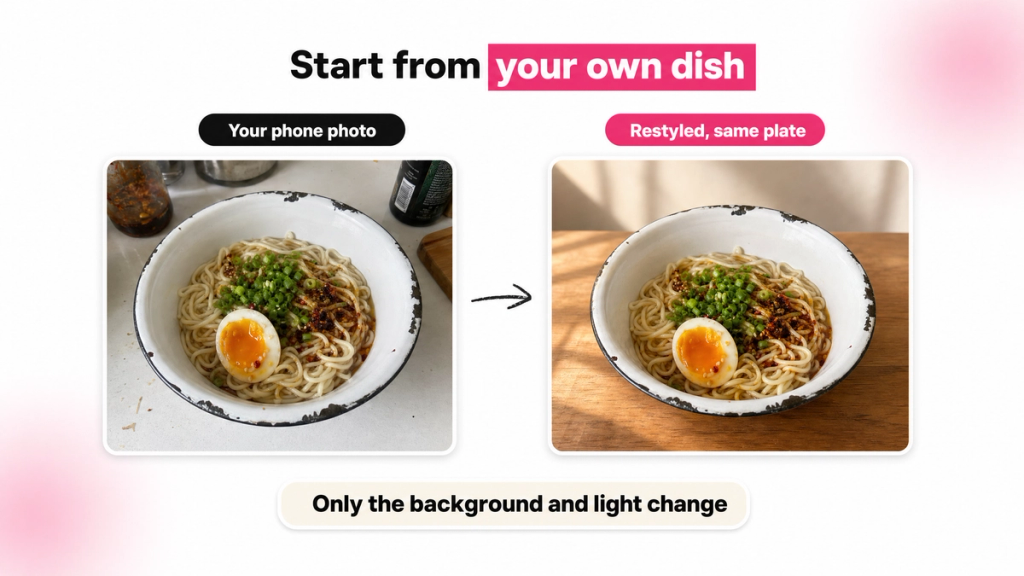
Customers compare a menu photo with the plate that arrives, so make sure to never use a generic dish photo. Start every photo from one of your own and let AI restyle it.
Restyle photos of your own dishes
Take a photo of each dish on your phone as it leaves the kitchen, in warm, even light. A plain phone shot is fine, as long as it shows the plate, the portion, and the garnish exactly as you serve them. Then upload it to an AI food photography tool and ask it to change only the background, the surface, and the light. Everything on the plate should stay as it is. If the tool adds a sprig of thyme you don't serve, or makes the portion bigger, regenerate it.
Restyling keeps the dish yours: the char on your flatbread, the way you swirl the sauce, the chipped enamel bowl your noodles come in. Those details make the photo look like your restaurant.
Give every photo the same look
To make the set look like it came from your kitchen, pick a background from your own space: your marble counter, your wooden tables, your tiled wall, your own plates and cutlery. Then make every photo on the menu match:
- Shoot one test dish first. Restyle one dish, approve it, then match the rest of the menu to it: the same surface, light, and framing
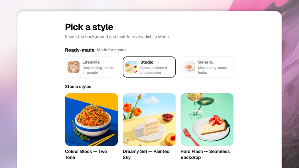
- Show the look, don't describe it. Give the AI one of your own photos to copy, a single plated dish on a clean background from your Instagram or camera roll. Words like "dark and moody" tend to come out too dark or too generic
- Keep props in your palette. Napkins, backdrops, and boards in your brand colors
- Keep the photo clean. No text, prices, logos, hands, or watermarks on the photo itself, and use the biggest original you have, not a screenshot
SecretSauce's Menu photoshoot does this for you: restyle one test dish in a look you choose, or in one saved from your own Instagram post, approve it, and it shoots the rest of the menu, up to 100 dishes, to match.
If you don't have a photo of a dish yet, AI can draw it from the description, plated simply and with nothing the description doesn't mention. Treat that as a placeholder, label it for yourself, and replace it with your own photo when you can.
Step 4: Write menu descriptions that sound like your kitchen
The trick is to avoid generic menu descriptions like "delicious, fresh, mouthwatering," which immediately sounds like AI. Try using one specific detail rather than three adjectives:
- The main ingredients, and where they come from if you can name it
- How it's cooked (charred, slow-braised, wood-fired)
- One thing that makes it yours (your grandmother's recipe, the chili oil you've made since opening)
- The allergens
Here's a prompt you can copy:
"Write a one-line menu description for [dish]. Ingredients: [list]. Cooked by: [method]. What makes it ours: [detail]. Allergens to mention: [list]. Use only these ingredients and don't add any. Lead with the most specific detail, use plain words, and leave out adjectives like delicious or mouthwatering."
Run it for your featured dishes and your Puzzles first. Your Stars may only need a name and a price. Keep every menu description to a line or two, because on the page they're the first thing to cut when space runs short.
Step 5: Lay out your AI menu design
This is the step many people picture when they think about how to create a restaurant menu. With your dishes, brand, photos, and menu descriptions ready, AI menu design can lay out the menu in minutes. The best layouts steer the eye to the 2 or 3 dishes you picked to feature and make everything else easy to scan.
Pick a design direction
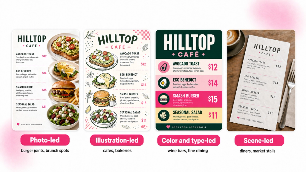
Before any layout, decide what carries the look. There are 4 main directions, and the right one depends on your food and your decor:
- Photo-led: Big dish photos do the work. Suits burger joints, brunch spots, and dessert bars, where the food is the draw
- Illustration-led: Hand-drawn dishes, ingredients, or patterns. Suits cafés, bakeries, and places with a playful or neighborhood feel
- Color and type-led: Bold color blocks and big lettering, few or no photos. Suits wine bars, fine dining, and anywhere with a strong signature color
- Scene-led: The design puts the menu in a setting, like a tabletop, a paper receipt, or a chalkboard, with every dish name and price set on top as typed text. Suits places with a strong theme, like a diner or a market stall
If you're unsure, ask the AI tool for one version in each direction and put them next to your Instagram grid. The right one will look like it belongs there.
SecretSauce's restaurant tools include a Menu Shortcut. Give it your dishes and prices (typed, or a photo, PDF, or website of your current menu), and it reads the list back for you to check. Then pick one of its ready-made layouts, or ask for a custom design: it shows you three different design ideas in your brand's colors and fonts, and makes the art only after you pick one.
Choose from these menu layout ideas
Pick the menu layout idea by how many dishes you have:
- Single page: One column fits up to about 14 dishes. Above that, switch to 2 columns. Best for cafés and short menus
- Bi-fold or tri-fold: A bi-fold fits about 22 dishes and a tri-fold about 36, with sections spread across the panels. Suits full menus with drinks
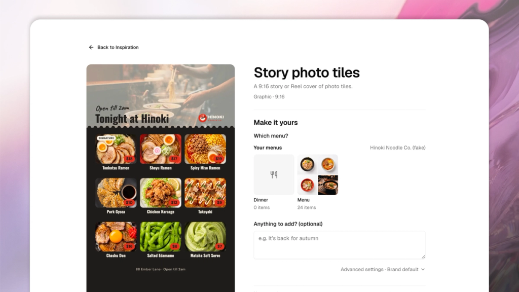
- Photo grid: A tile per dish, up to 9 on a portrait page, 6 on a square post, or 12 on a landscape screen. Suits short menus with strong photos
Shorter menus are also easier to design. Lightspeed, a restaurant POS company, reported on a 2018 Bournemouth University study that found 6 items per section worked best for fast-food and quick-service restaurants, and about 7 appetizers, 7 desserts, and 10 entrées for fine dining.
Guide the eye to your featured dishes
Make sure your top dishes stand out on the menu layout. Here's how:
- Give 2 or 3 dishes a feature. A photo, or a box in your tint color. If every dish has a photo or a box, nothing stands out. On a photo grid or a photo-led menu, give your featured dishes the biggest tiles or the first spots instead
- Put featured dishes at the top of their section.
- Tag sparingly. A "Chef's pick" tag on a Puzzle, or "New" on a dish that's new, helps. Five tags on one page cancel each other out
- Keep prices in the same style as the dish name, or smaller. Put them right after the dish or its description. Dotted lines from the dish to the price are optional
Set the type and the space
Type and spacing make a menu look designed:
- Use 4 text sizes, from biggest to smallest: the restaurant name, section headings, dishes, and descriptions. Set menu descriptions under each dish in your muted text color
- Put section headings in your accent color with a thin line underneath
- Keep text and the logo at least 6% of the page's shorter side from every edge, about 13 mm on an A4 page
- Never split a section across columns or pages
- If the menu runs long, add a page instead of shrinking the type. Cut menu descriptions first, then taglines, never dishes or prices
- Never put text straight onto a busy photo. Put a solid panel behind it, or move it
Step 6: Make every format from the same design
Customers meet your menu in more places than the table. Make every version from the same dish list and the same brand, so customers who see your Instagram post recognize the menu on the table.
| Where | Size | What to watch |
|---|---|---|
| Table menu | 210 × 297 mm (A4) | One or two columns |
| Table tent | 4 × 6 in | One offer, big type |
| Wall poster | 297 × 420 mm (A3) or larger | Type about 1.4 times bigger, fewer words |
| Instagram post | 1080 × 1350 or 1080 × 1080 px | A photo tile per dish, no menu descriptions |
| Instagram story | 1080 × 1920 px | Keep text out of the top 14% and bottom 20%, where the app's buttons sit |
| TV menu board | 1920 × 1080 px | Landscape, a few photos, big type |
Print and QR menus
Set print files to 300 dpi (dots per inch, a measure of how sharp the print is). If you're sending the menu to a print shop, ask what file they need before you design, because many want bleed (extra image past the cut line) and crop marks (lines that show where to trim). If your menu tool exports an image with no bleed, send it to the shop first and ask whether they can print it as it is or add the bleed for you.
Add a QR code if you like, but use your own, from your website or ordering system. Never use one an AI tool makes up.
Delivery apps
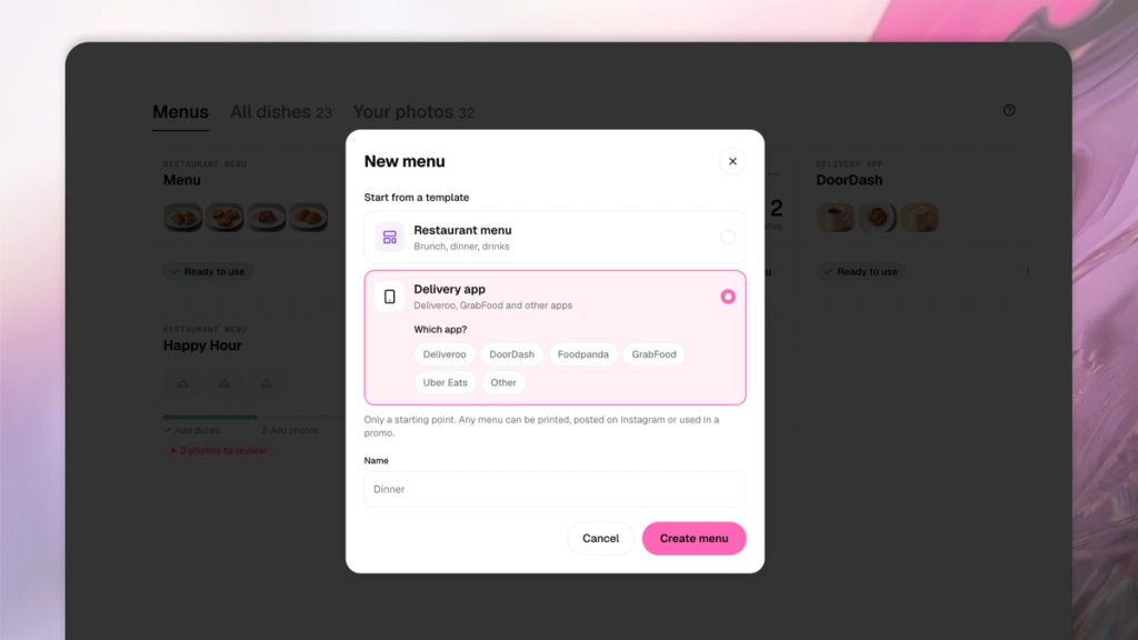
Uber Eats, DoorDash, Deliveroo, GrabFood, and foodpanda each set their own photo sizes, and they change, so check the current size in your partner dashboard before you upload. Within each app, keep every dish on the same background, angle, and light, and give every dish a photo, because people ordering on an app can't see the food any other way.
Google and Instagram
Add a link to your menu to your Google Business Profile and build a photo gallery that covers your whole menu, because people looking for somewhere to eat often check Google before they decide.
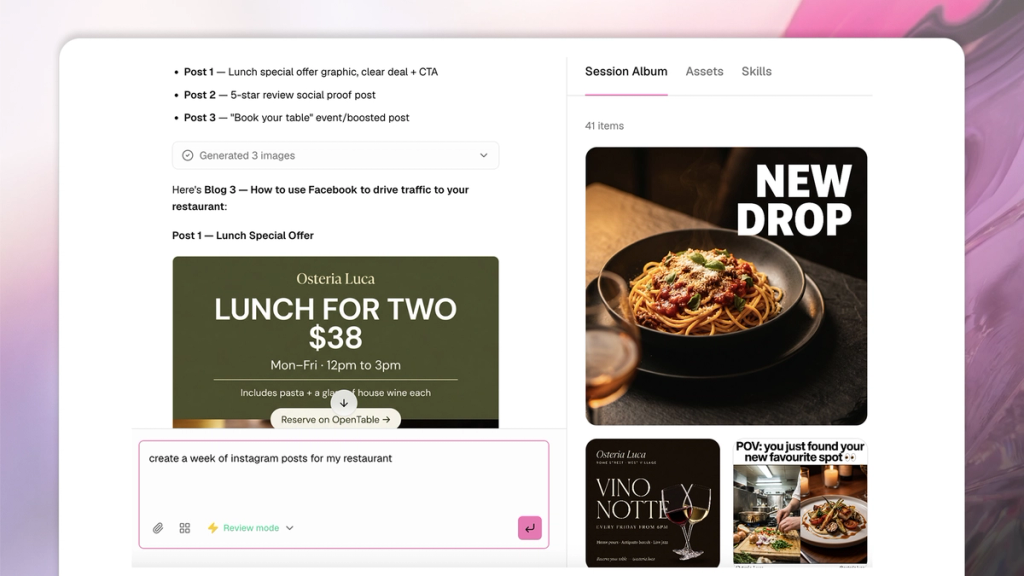
On Instagram, post the new menu as a carousel and give each new dish its own post. Stories suit timely promos and specials on social media, like today's special or a sold-out dessert, because they disappear when the special does. Run a promo as a set (a post, a story, and a poster for the window) so it looks the same everywhere.
Johanna Sharonn, co-founder of Muscle Munchies, a high-protein bakery brand in Singapore, put it this way after one post: "I posted one image on Instagram and got multiple orders the same day." Read how this online food brand got same-day orders from one photo.
Step 7: Check the menu before you publish
Whichever tool you use to create a restaurant menu, check it before it goes out. Compare every version with your dish list first, then look for the AI tells.
Check the facts
Paste your dish list and a PDF or photo of the finished menu into an AI chat with this prompt:
"Compare this menu with my dish list. Check every price character for character, count the dishes in each section, check the spelling of every dish name, and list any dish that's on one but not the other. Don't fix anything. Only list the differences."
Fix what it finds, then go through these yourself with a pen:
- Every description lists only what's on the plate
- Every allergen comes from your recipes, never from an AI guess
- The QR code is your own and opens the right page
Check for AI slop
Then look at it the way your customers will, ideally printed or on your phone:
- Every photo looks like the plate that leaves your kitchen: same portion, garnish, and plate
- All the photos share one surface, light, and angle
- No stray letters, fake signs, or squiggles hide in any photo's background
- The fonts are yours, not a lookalike
- The logo is your own file, not a redrawn copy
- Your 2 or 3 featured dishes are the first things your eye lands on
- Text is readable at arm's length (print) or from across the room (wall or screen)
If a photo fails your checklist, regenerate it from your own photo.
Designing a restaurant menu with AI
The quickest test for an AI menu is to hold it next to the food. If the photos look like your plates, the colors look like your room, and the type looks like your sign, customers will see your restaurant on the page. If you remember one thing about how to design a restaurant menu with AI, make it this: give AI your own dishes, your brand, and the look of your room, then check that it kept them.
Give the new menu a month, then paste your latest sales report into the same AI chat and run the dish-list prompt again. Your featured dishes should be selling more. If a Puzzle still isn't moving, give it a photo or a new description before you cut it.
SecretSauce keeps your colors, fonts, logo, and dish photos in your Brand Brain, so your next menu, specials post, or window poster starts from them.
Make your first menu with SecretSauce
Frequently asked questions
How do I design a restaurant menu?
Start with your dishes, then your brand, then the layout. Pick the 2 or 3 dishes you most want to sell, save your colors, fonts, and logo, and restyle photos of your own dishes so they share one look. Then have an AI menu tool lay it out with those dishes featured. That's how to design a restaurant menu that looks like your restaurant rather than a template.
How do I make a menu for my restaurant?
The quickest way to make a menu is to start from the one you already have. Upload a PDF, a photo of your printed menu, or your delivery app page to an AI tool, and check the dish names and prices it reads back. If you're working out how to make a menu from scratch, write down every dish and price first. Everything else builds on that list.
What is the best AI menu generator?
The best AI menu generator for a restaurant works from your own dish list, your brand's fonts and colors, and photos of your own dishes rather than stock food. It should also leave your prices exactly as you typed them. SecretSauce's Menu Shortcut works this way: it checks every price against your list character for character, and labels any dish image it drew without a photo "generated from description." Whichever tool you try, run your current menu through it before you commit, and check the result against your plates.
Should a restaurant menu have photos?
It depends on where people see it. On a mostly text menu, put photos on the 2 or 3 dishes you're featuring. A photo-led menu, a delivery app, or an Instagram menu needs a photo for every dish. Either way, use photos of your own plates.